

You've Been Looking at Colour Wrong This Whole Time
- zenikoworld
- Apr 30
- 3 min read

Okay, real talk the first time someone said "colour theory" to me, I pictured a whiteboard full of formulas and a very long nap. It sounded like something you had to suffer through before you could get to the fun part of art.
But here's the thing: colour theory is the fun part. It's basically the cheat code for making your artwork, designs, or even your Instagram feed look incredible. And once it clicks? You'll never unsee it.

Let's me break it down to you no boring textbooks, I promise.
First Things First: What Even Is Colour Theory?
At its core, colour theory is a set of guidelines that explains how colours relate to each other and how to use them together in a way that feels intentional, balanced, and visually satisfying. Think of it as the grammar of the visual world. You can technically communicate without it, but with it? Everything just flows.
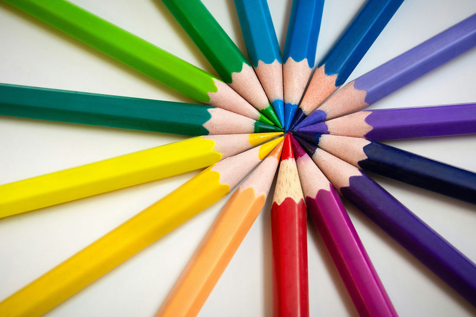
It all starts with the colour wheel the OG, the classic, the one your art teacher had on the wall. Twelve colours arranged in a circle. Simple. But wildly powerful.
The Three Families You Need to Know

Primary colours (red, yellow, blue) : the originals. You can't make them by mixing anything else, but you can make everything else from them.
Secondary colours (orange, green, purple) : born when two primaries fall in love and make a baby colour.
Tertiary colours : the sophisticated middle children. Red-orange, yellow-green, blue-violet, the ones that give your palette that "I know what I'm doing" energy.
Colour Combos That Actually Work And Why?
This is where it gets really good. There are tried and tested colour combinations called colour schemes that have been making art look stunning for centuries.
Complementary colours sit directly opposite each other on the wheel, think blue and orange, or red and green. They create high contrast and make each other pop. This is why superhero posters always look so dramatic.
Analogous colours are neighbours on the wheel like yellow, yellow-green, and green. They create harmony and feel naturally cohesive. Perfect for when you want something soothing and put together.
Triadic colours form a triangle on the wheel three colours equally spaced apart. Bold, balanced, and full of personality. A little harder to pull off, but when it works? Chef's kiss.
Warm vs Cool : The Mood Makers
Here's a little secret, colour doesn't just look a certain way it feels a certain way. Warm colours (reds, oranges, yellows) feel energetic, passionate, and bold. They pull you in and demand attention. Cool colours (blues, greens, purples) feel calm, peaceful, and introspective. They give space and breathe.
This is why the lighting in a cosy café feels so different from a hospital corridor and why a painting can make you feel something before you even understand what you're looking at. That's the magic of colour doing its job.
How to Actually Use This in Real Life
You don't have to be painting a canvas to use colour theory. It shows up everywhere in fashion, interior design, graphic design, photography, even the way you plate food. Once you understand how colours speak to each other, you start seeing intentional choices everywhere.
Start small: Next time you're putting together an outfit, a mood board, or even arranging objects for a photo think about what colours are next to each other. Are they fighting? Harmonising? Creating contrast? Play with it. Trust your eye, and then slowly learn the theory behind why it works.
The Takeaway
Colour theory isn't a rulebook it's a "toolkit". And the more you play with it, the more intuitive it becomes. You'll go from "I hope this looks okay" to "I know exactly why this works" and that shift is everything.
Art is a language, and colour is one of its loudest voices. Now that you know the basics? Go make some noise.


Comments